I’m working with two clients at the moment on their branding. Both businesses are sooooo different from each other. Complete chalk and cheese! One is a professional services firm who has been in business for many years, whilst the other is an online retailer who is only 3 months old. Interesting both logos use blue as their main colours. What is the obsession with blue for business logos?
Is it seen as a safe business colour? Nice and corporate? Moderate ground, not too controversial?
However, it remains that their challenge is the same. Creating a logo and branding that appeals to their target audience and conveys the right personality and values for their business.
Branding is so often over looked by smaller business owners but if you get it wrong it can be very limiting to your business potential.
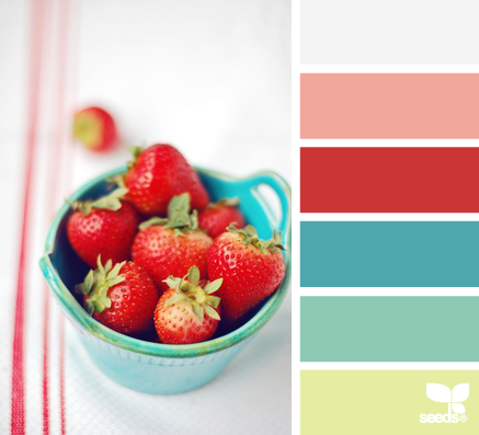
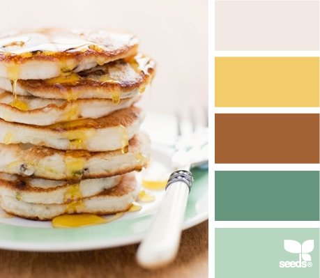
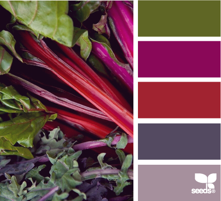
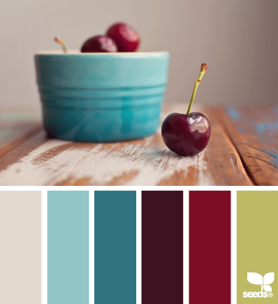
Let’s take the online retailer. The products are food related and yet the branding and logo colours and design of the website feels really cold and clinical. Blue isn’t a colour associated with food for obvious reasons. When did you last eat something that was blue?! Never? The name of the business had driven the colour choices but the end result didn’t ‘fit’ with either the products or the gourmet food-related proposition. Think of all your Jamie and Nigella cookbooks – what colours do the images use – deep yellows, rust reds, deep pinks, vibrant plum, rich browns, burnt orange, zesty yellow and lime, and fresh greens (not a blue in sight!).
So we’re digging out some tasty food images and a bit of nature for inspiration. I have found this great colour resource for the client from a talented lady who has a design blog called Design Seeds. Jessica is a colour specialist and obviously knows her stuff, these colour palettes are very useful. We’ve got plenty of food for thought now! Once the re-brand is complete I will share a before and after and you can see what you think too.
Here is some of our inspiration – images courtesy of Design Seeds:
Still stuck for logo colour ideas? Try this colour selector tool for some refreshing colour logo and branding options.
The professional services firm is giving their mature business a much needed re-fresh and we’ve enjoyed the experience of revisiting the company’s brand values and proposition and using these to shape a fresh and more contemporary new look. The use of a more Corporate blue is appropriate to their business and target audiences – confident, professional and straight forward. But there are so many shades of blue and you don’t have to stick to a really boring blue. Their new branding is shaping up really nicely and will be revealed shortly. I can’t show anything yet but watch this space!
When I was developing my own branding, I deliberately picked the fresh apple green and juicy red to give a contemporary, approachable and fresh feel to my marketing consultancy. I didn’t want stuffy and boring dark blue that’s for sure! I love my branding (almost 5 years on) and I know my clients do too! It helps attract the right customers to my business. And your branding could too!
How did you go about deciding on your brand colours? What inspired you?


